Visualizing the Carbon Impact of Foods
One of the areas where individual lifestyle choice can have the biggest impact on carbon emissions is the choice of what one eats. Project Drawdown identifies plant-rich diets as one of the highest impact solutions for reaching net zero carbon emissions. I wanted to understand not only the impact of the food I eat, but understand how to easily make better choices, without getting overwhelmed by the complexity of the problem. And I wanted to find a way to share that information with others who want to do the same in a way that will actually support behavior change.
I was inspired by a post from Our World in Data which visualizes the results of a study by Poore and Nemecek on the end-to-end emissions produced by different food items.
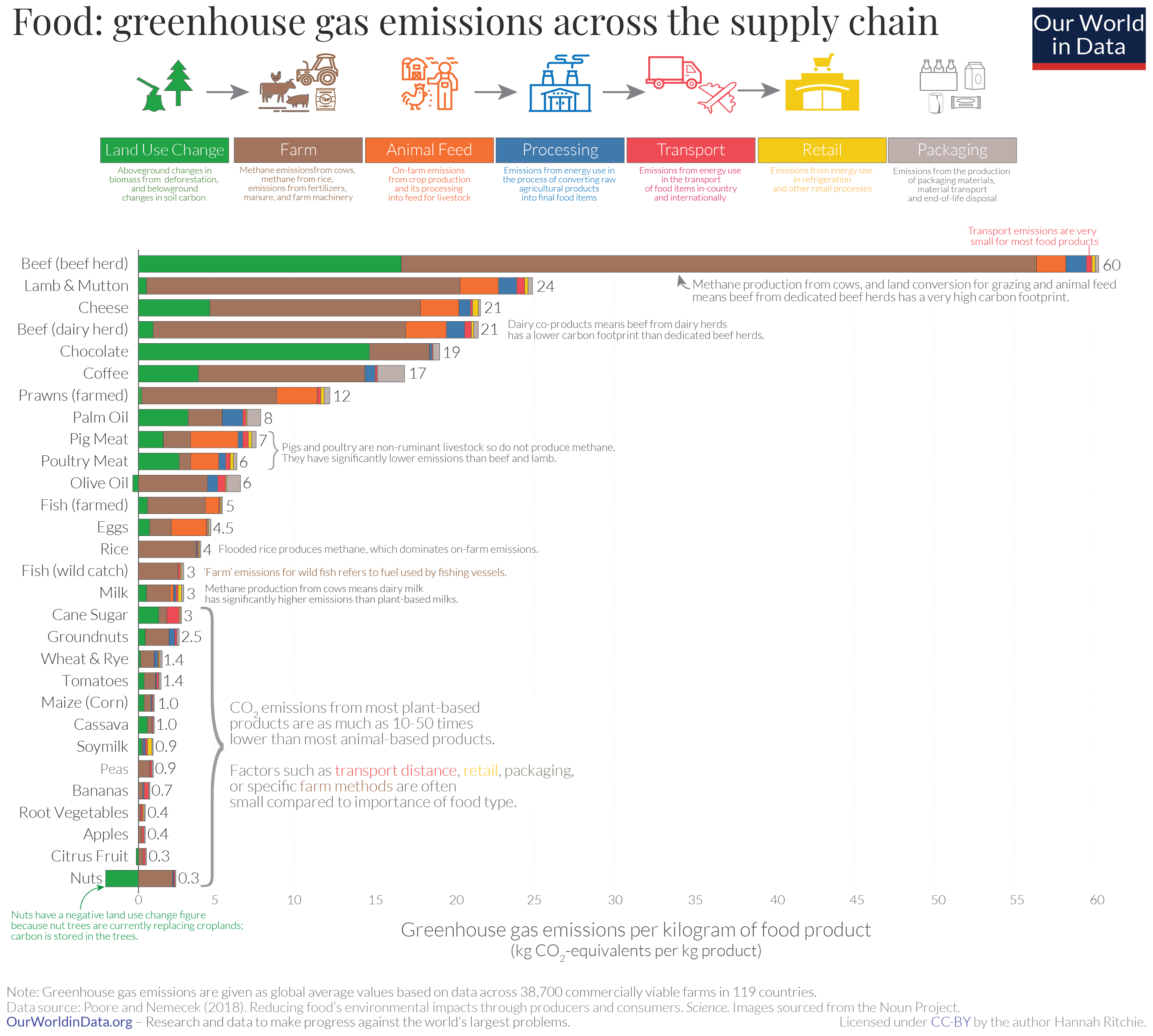
This visualization does a good job of illustrating that transportation related emissions are a fairly small component of the entire life cycle of emissions, so focusing on what you eat is probably more important than where it’s from. The other thing that stands out is just how much more of a greenhouse gas impact some some foods have than others. At opposite ends of the graph, we see that beef has a carbon impact 200 times that of citrus fruit!
Learning all this information had me thinking about my own diet, but I struggled to apply the information as presented in my daily decision of what to eat for dinner. The data is presented in units of kg CO2e / kg of food product, but foods can have wildly different density and calories and are used in different quantities. Additionally, I don’t usually think of food in terms of weights. I have a pretty good idea of how much food is in a meal, but I have no idea how much it weighs. This left me struggling to understand the impact of different meals and how to make comparisons. How does a chicken burrito compare to a slice of pepperoni pizza? I know that a salad will have lower emissions than a cheeseburger, but by how much?
I wanted to build a simple intuition of the carbon emissions embodied in these food products so that I could easily make decisions about what to eat without having to do careful tracking and accounting of my diet. I set about trying to create a series of visualizations to try and build that intuition for myself in a way that I could share with others.
Physical Visualizations
My first attempt was to try and tap into my visual and physical intuition of food serving sizes by creating a data visualization using physical foods. I took a series of photos of different food products cut into serving sizes that all had the same greenhouse impact, 1 lb of CO2e.
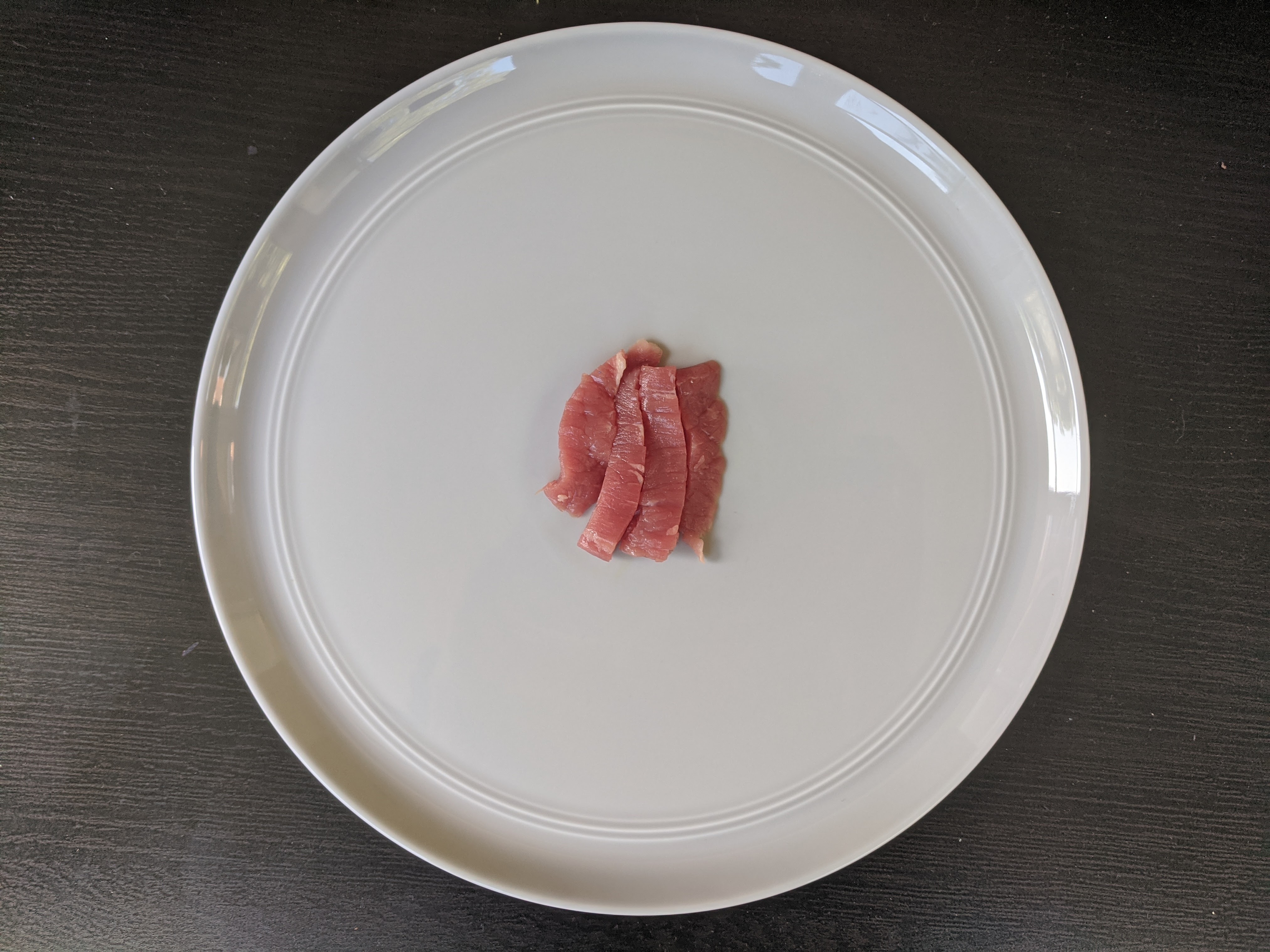
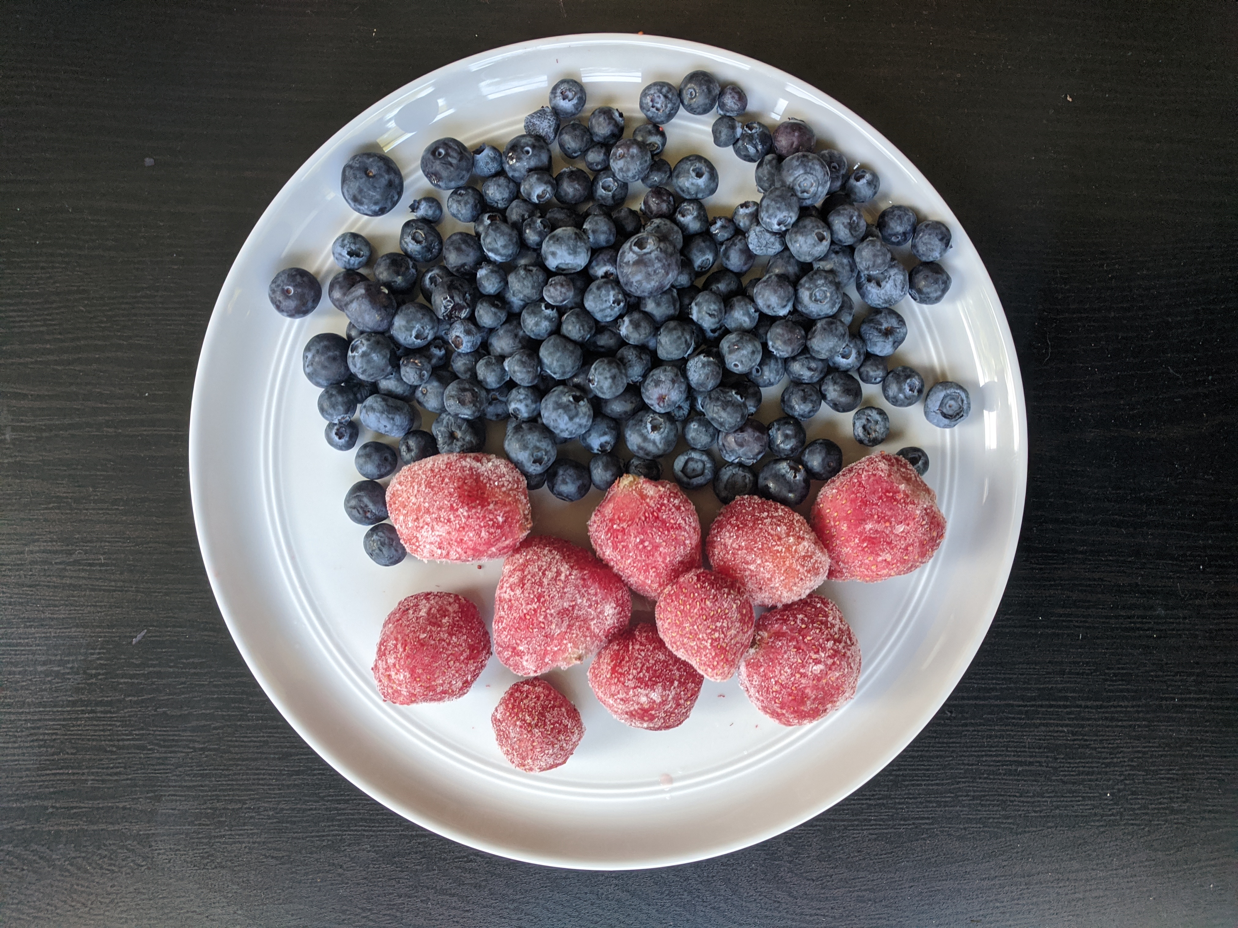
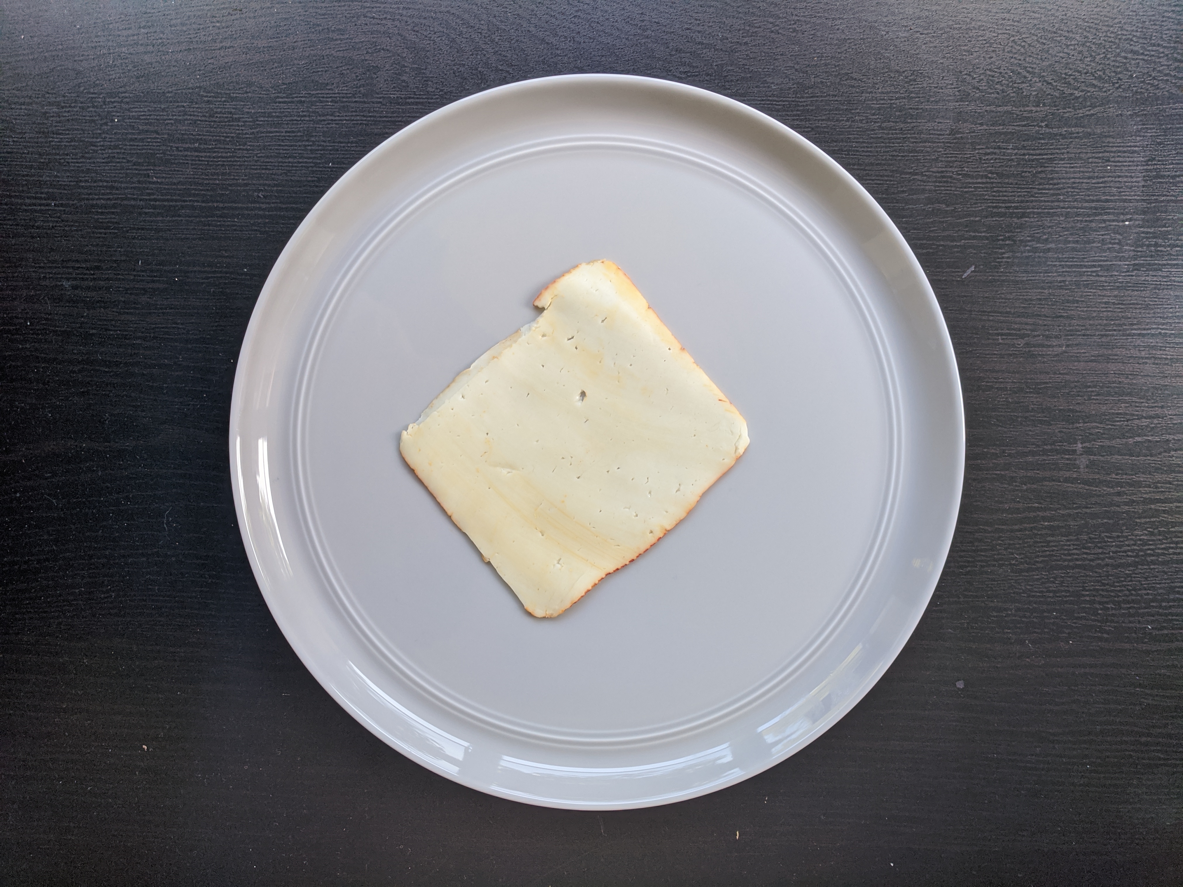
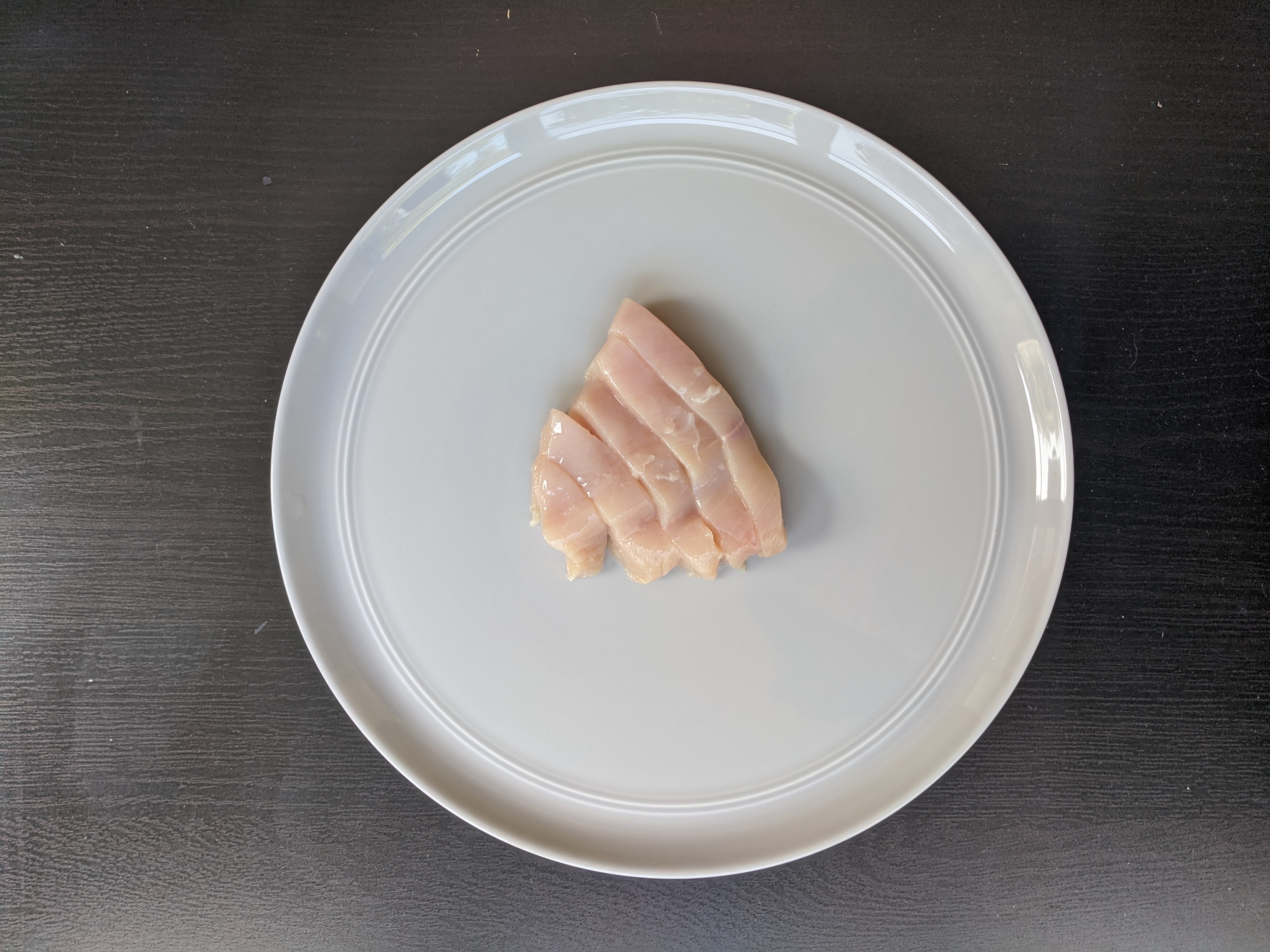
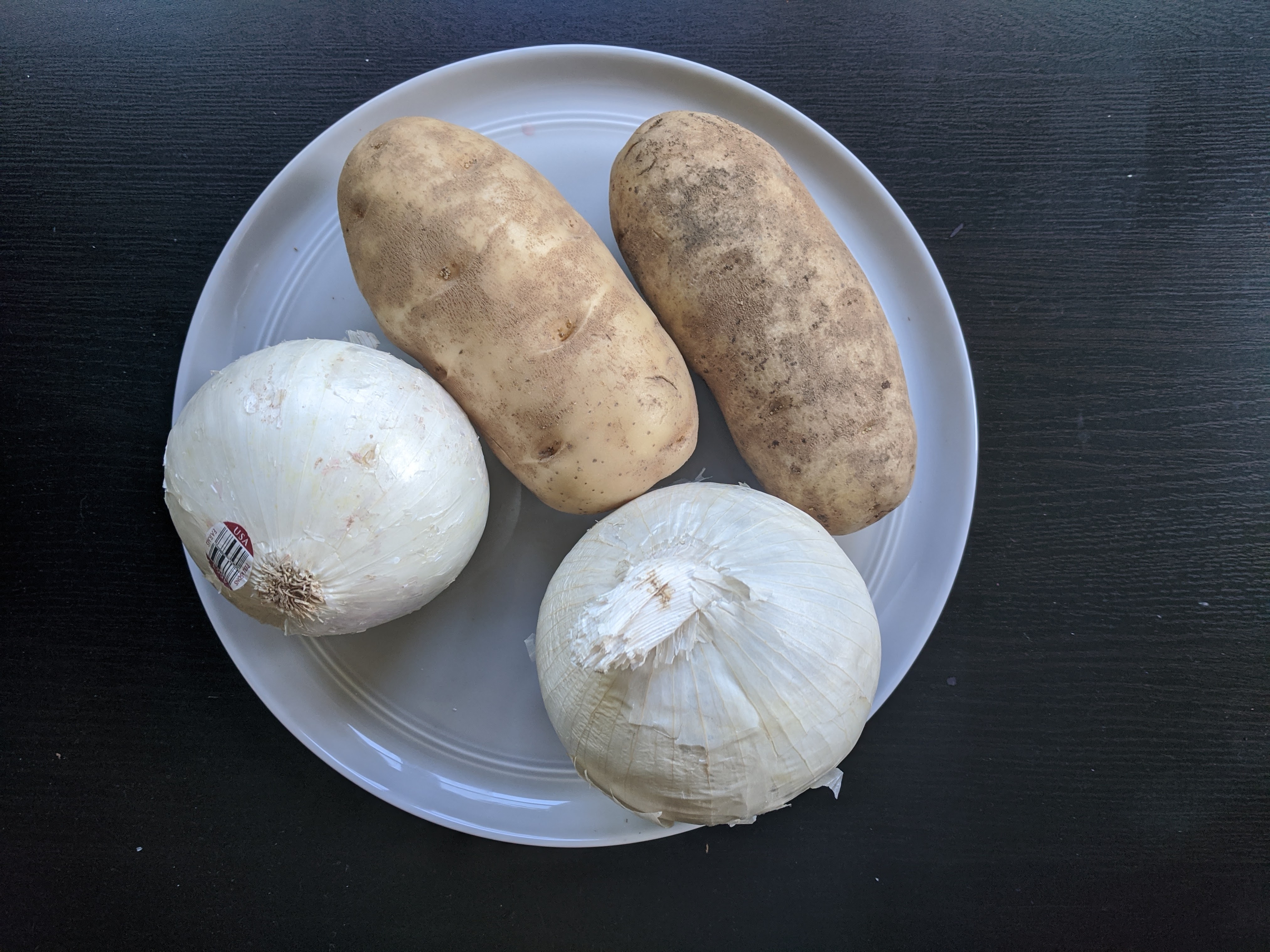
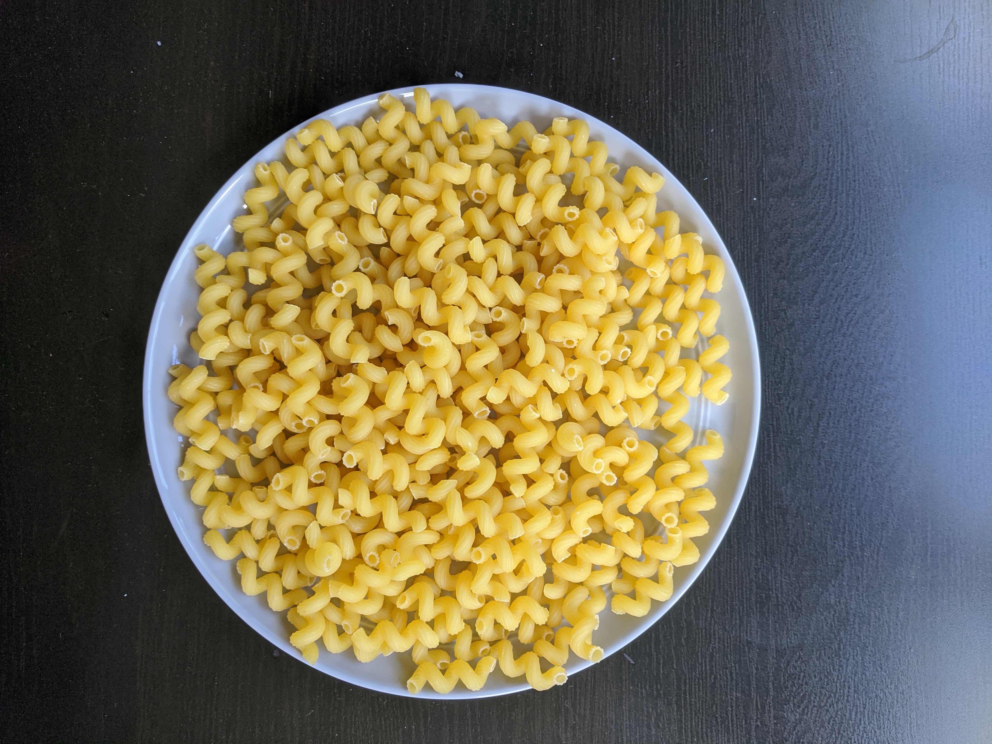
These photos helped me start to build an intuition for creating recipes: one slice of cheese is equivalent to half a chicken breast or two potatoes and onions or a whole box of pasta. However, as a visualization there are some elements that are lacking. The meats and cheese are thinner than the plant-based foods, so they appear to take up more area from this camera angle. They also only focus on ingredients and not on complete meals.
I think food-based data visualizations could be much more powerful in person, where people can physically interact with (and eat!) the visualizations. I’d love to create some dishes based off this rationing of ingredients. Unfortunately, my ability to host in-person food visualization meetups is severly hindered in 2020, and my food photography skills are lacking for digital sharing.
Meal Visualizations
Another question I wanted to explore, was how do I make choices between similar options? If I am at a particular restaurant, how do I choose between menu items? To do that, I used serving size information from Chipotle and Naf Naf to calculate the carbon impact of different options. Using the steak option as a reference point, you can see how many servings of other options you could order and still have the same carbon impact.
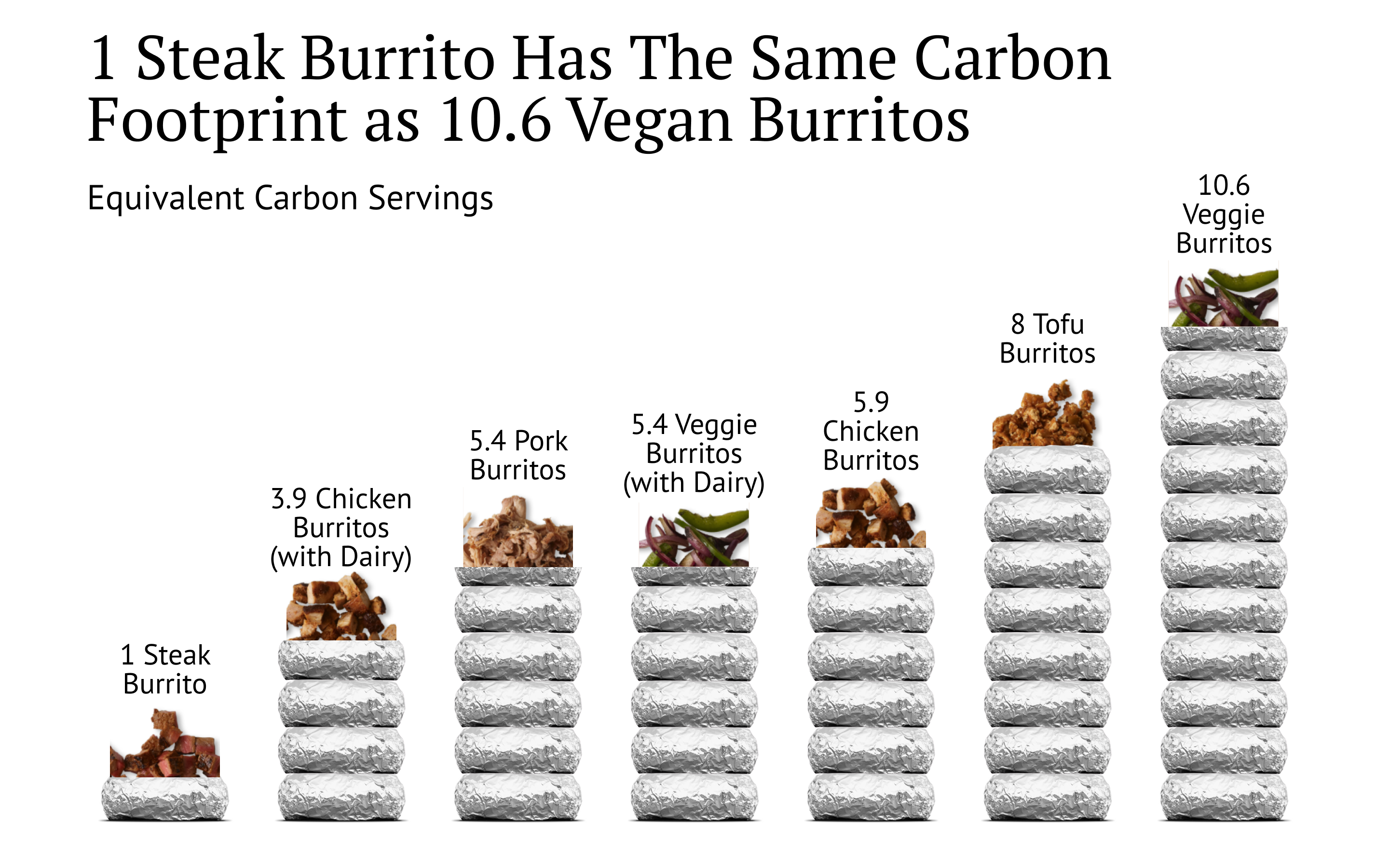
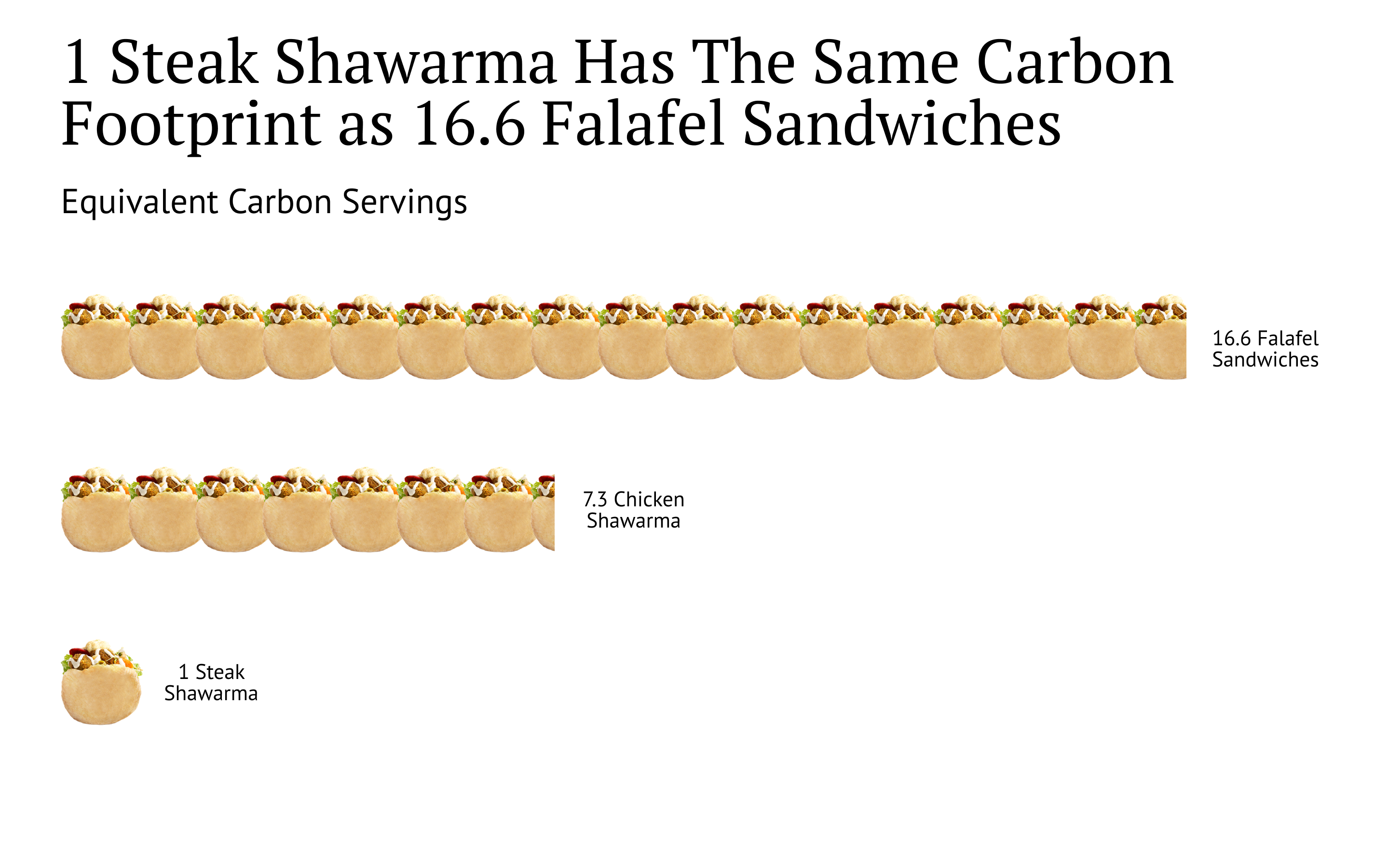
I think these visualizations help build a more nuanced intuition beyond just “plant based foods are lower impact than animal based foods”. Beef has an extremely high impact, ten times or more than vegan options. Adding meat like chicken or pork increases the impact of a meal, but only by a factor of two. And adding cheese and sour cream to your vegetarian burrito has as much carbon impact as if you were eating pork or chicken! So if your goal is to reduce carbon emissions in your diet, cutting cheese is as important as cutting chicken or pork.
Since I wanted to keep part of the photographic food visualization in these graphs, I wound up creating graphs that were much more “infographic” than my typical matplotlib fare. I took some advice from Stephanie Evergreen and gave them a strong headline. I think a lot of data visualization advice focuses on making things clear and accurate, but a lot of her advice is on how to make data visualization persuasive. It makes me want to reconsider some of the ways I use data visualization in my work and how I may need to adopt some broader tools for visualization. The graphs above were done using Figma, which overs extensive visual control, but limited data-driven drawing.
The 1.5-lb Rule
Working through all the data to create the graphs above, I started to see that different permutations of meals started to look similar. If you start to look at standard serving sizes, most foods tend to have the same carbon impact.
Averaging things together, 1.5 lbs of plants has roughly the same impact as 1 lb of grains, 4 oz of pork or chicken, a cup of milk, two eggs, or 1 oz of cheese. All of these serving sizes have the impact of roughly 1.5 lbs CO2e.
The average meal is 1.2 lbs of food, so if you take a combination of plants and grains as the base, you’ll end up with a carbon impact close to 1.5lbs CO2e. Add some pork or chicken and you’ll double it. Adding some eggs or cheese has the same impact. Since we eat roughly 1000 meals per year, we can quickly get to an annual impact.
The major exception is of course, beef. A 4 oz serving of beef has an impact of 15 lbs CO2e, ten times the impact of the standard servings of other foods! From an environmental perspective, cutting beef consumption is one of the most significant actions you can take.
